Paris Fashion Week
Here a collection of Paris Fashion Week, sharing from around the world performing shows a well-known fashion brands.fashion conference information! Different fashion brand, brings you a different design inspiration!
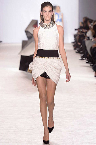
"They're bad characters. They've got morning-after hair, and they've thrown on their haute couture to run around in the next day." Giambattista Valli painted a vivid picture of his muse backstage before his show. When he landed on the couture schedule six seasons ago, he didn't so much set out to rewrite the rules as he did to inject the made-to-measure world's rarefied confines with a young energy, aided and abetted along the way by his photogenic front row of international jet-setters. Rarely, though, has Valli's magnificent obsession with youth been more apparent than it was tonight, with his emphasis on a short, supremely leggy silhouette and what he called a "spontaneous attitude."
He built his party outfits on a fitted miniskirt base, sometimes swagging rolls of duchesse satin around the hips on top of that mini, and other times layering a short-in-front, long-in-back kicky pleated skirt with a splice up the middle over the top. Above that it could be a cropped top in a silk cloque with a grosgrain-ribbon hem, or a sleeveless silk shell embroidered in iridescent blue three-dimensional floral appliqués. Valli's fabrics and embellishments tended toward the dense and heavy, the polar opposite of Raf Simons' work at Dior today. By the same token, the color palette (especially that vivid blue and pink on black) and the voluminous, peplumed shapes owed a noticeable debt to Simons' debut at Dior circa July 2012.
Simons is leading the fashion conversation at the moment; it's probably all too easy to get swept up in it. But Valli is a runway veteran, with plenty of his own things to say about layering print and texture. They resonated most clearly in Joan Smalls' appliquéd floral-print dress with a matching crop top worn over it, and again on an Yves Klein blue thigh-slit ball gown topped by an abbreviated black bugle-bead embroidered tank. That look was youthful in a way that was entirely Valli's own.
BRAND: GIAMBATTISTA VALLI | GIAMBATTISTA VALLI OFFICIAL WEBSITE
PARIS: Giambattista Valli Spring 2014 CoutureWWW.GIAMBATTISTAVALLI.COM
TOTAL: 34 PICS UPDATE ON: 2014-01-20 BY CBAMD.COM
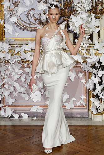
Our review will be posted shortly. See the complete collection by clicking the image at left.
BRAND: ALEXIS MABILLE | ALEXIS MABILLE OFFICIAL WEBSITE
PARIS: Alexis Mabille Spring 2014 CoutureWWW.ALEXISMABILLE.COM
TOTAL: 23 PICS UPDATE ON: 2014-01-20 BY CBAMD.COM
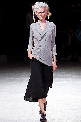
After his tour de force collection of last season, it appears that Yohji Yamamoto is now gleefully back with a vengeance. If that last show was something of a "greatest hits" with the freshest of spins, this season is a varied selection of hits to come. The new spirit that is possessing Yamamoto is timely. If there are two designers whose oeuvres are being looked at by many others this season, it is Yohji Yamamoto's and Issey Miyake's. And now Yamamoto is showing them how it is done in the present.
The mood was rebellious once more. A recurring theme seems to be emerging in Paris this season, with designers going against the grain and challenging preconceived notions of themselves, particularly by flirting with a sense of "bad taste." Yamamoto was no different. His silhouettes might have started with a delicate study of the shoulder in his beloved black—here the structure was softened, with tailored jacket sleeves barely held by bows, chains, threads, and cord—but all of a sudden, there was a full-frontal assault of flouro. Yes, flouro: a complete look of layered pink, yellow, red, and orange with turquoise and red boots to match.
In the eighties, Yamamoto and Comme des Garçons were seen as the cool, black antidote to the decade's Day-Glo nonsense, and here the designer is embracing it wholeheartedly and happily in great swaths of this collection. As Yamamoto's PR pointed out, somewhat aghast, the inspiration of Harajuku girls was also involved in parts. That's something this designer would never normally look at. "This collection's private title is Meaningless Excitement," said Yamamoto after his show, laughing mischievously.
And perhaps Mischievous Excitement might be a more public title for this collection, because Yamamoto transformed the trendy and transitory into something a bit more substantial: In its fresh use of flouro; in those casually abstracted layered looks; the architectural slatted structures; the digitized camo prints on chiffon tailoring; the terrific, perverse knitwear; the bell-meets-kimono-sleeve shirtdresses—there is, in short, much to choose from. The collection came to an end with lights flicked off, one by one, and the focus on a gang of girls in white shirts and black skirts, worn with the rough-and-tumble attitude of the British comprehensive school uniform. The separated sleeves were back from the beginning, this time without their jackets. In anyone else's hands, all of this might have looked tricky; in Yamamoto's, it just felt so fresh and easy.
When asked after his show whether he was in a rebellious mood, Yamamoto replied, "Yes, I am. And I hate doing something that I refer to in fashion as déjà vu. For this collection I made so many trials of cutting, playing on the shoulder, the strips, the fresh neon color…so many trials. And it was something I needed to do!" When it was pointed out that not many designers could get away with presenting so many varied things with such skill in a collection, Yamamoto responded, in a theatrical stage whisper, "That's because I'm genius!" He was joking, of course, but the thing is, he kind of is just that.
BRAND: YOHJI YAMAMOTO | YOHJI YAMAMOTO OFFICIAL WEBSITE
PARIS: Yohji Yamamoto Spring 2014 Ready-to-WearWWW.CBAMD.COM
TOTAL: 48 PICS UPDATE ON: 2013-11-20 BY CBAMD.COM
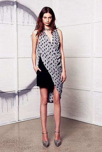
Sydney-based Willow is in the midst of a fast expansion back home, opening stores at a breakneck pace. So there was something metaphorically fitting about the fact that the premise of Kit Willow's latest collection was the dot: You could think of it as a barely there point in space, but considered from another angle, it contains infinity.
That theme played itself out here in various ways: There were physical dots, both actual ones, on tulle, and extrapolated leopard spots and perforation; the collection also emphasized circular cutting, with material draped in great swathes. Willow got at the idea of shifting perspective with materials like holographic silver leather that bounced the eye around, and via garments that could be worn in multiple ways. In those instances, adaptability was mainly expressed through long straps, which could hang loose or wind around garments to change their silhouettes. The problem with that strategy, though, was that the straps were a distracting element unless, and until, they were put to use. The circular cutting worked better, resulting in some interesting asymmetric looks. Willow's emphasis this time out was on relaxed shapes, and pieces that could not only be adapted on their own but also mixed and layered in almost modular ways. Again, the theory was better than the practice, as all the diffuseness and changeability meant that no particularly strong proposition emerged through the collection as a whole. The designer also seemed to be hedging on whether she wanted to give her conceptual program its due, or create good commercial pieces. The more straightforward and commercial looks were the strongest here; an ensemble such as a sharp pair of tapered trousers and split bias-cut blouse might not have contained infinity, but it was focused like a point. Sometimes, that's enough.
BRAND: WILLOW | WILLOW OFFICIAL WEBSITE
PARIS: Willow Spring 2014 Ready-to-WearWWW.WILLOWLTD.COM
TOTAL: 23 PICS UPDATE ON: 2013-11-18 BY CBAMD.COM
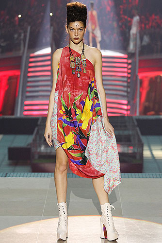
Vivienne Westwood continued her medieval streak today, shifting from last season's riff on the Crusades to this one's bounce off the Canterbury cloisters. What got Westwood going, according to her show notes, was the idea of how ordinary people lived in the Middle Ages with a completely matter-of-fact belief in transfiguration. That's an interesting theme, but per usual, Dame Viv pursued it in a flotsam-jetsam way: There were peak-shouldered jackets, second-skin knits, lace made out of leather, draped bias-cut dresses with a goddess-y feel. There were also painted tropical florals, fantastic full skirts bursting with tulle, and, among other things, cats. The cat thing really made you wonder if Westwood was up to something much more crafty and clever than she was letting on, which was to create a collection so unbelievably random and occasional in its appeal that it actually re-created the experience of falling down the K-hole of the Internet. Anyway, kudos if so, and even if not, you always have to give Westwood total credit for the knockout looks she inevitably flashes up on the runway. Catching sight of her full black skirt with wine-colored tulle, plus matching cleavage-baring top, was a bit like happening upon a cut of the dance scene from Bande à Part on a glassy-eyed browse through YouTube. Cat video, footage from an eccentric wedding, some vlogger's selfie rundown of the stuff she bought on a recent shopping trip, a drunk cover version—in Finnish!—of Britney Spears' "Toxic," and then, out of nowhere, a masterwork. The woman's a legend. She can do what she wants.
BRAND: VIVIENNE WESTWOOD | VIVIENNE WESTWOOD OFFICIAL WEBSITE
PARIS: Vivienne Westwood Spring 2014 Ready-to-WearWWW.VIVIENNEWESTWOOD.COM
TOTAL: 53 PICS UPDATE ON: 2013-11-14 BY CBAMD.COM
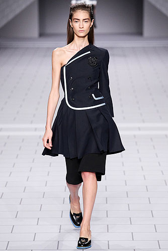
The Viktor & Rolf show is one of those in Paris where it takes people a while to filter in and get to their seats, so if you arrive early, you have plenty of opportunity to contemplate the set design and consider what it may foretell of the collection about to be shown. This season, what with the black and white, bricklike backdrop, you thought, "I wonder if the soundtrack will be Pink Floyd's The Wall?" And further: "Maybe the collection will be a treatise on school uniforms and rebellious youth.…" Those predictions were accurate. "Another Brick in the Wall" played in a cover version, and on the catwalk Viktor Horsting and Rolf Snoeren executed their own deft cover versions of the schoolgirl look, playing adaptive games with knife pleats, plaid, and crested blazers. There was a ton of commercial appeal in all that, particularly with regard to the long, voluminous shorts, a standout silhouette that Horsting and Snoeren properly emphasized.
The most challenging pieces featured an innovative pleat construction that pushed the school uniform thing in an editorial direction; the weakest looks, meanwhile, were those embellished with safety pins or studs. That punk throwback felt a little played out, though it did speak to this season's Viktor & Rolf theme in an apt way. It's probably also true that the girl Horsting and Snoeren are trying to reach with their ready-to-wear isn't convinced that things like studs are passé, and those punk-inflected pieces had the look of stuff that will sell. They should have played another Pink Floyd cover today: The song "Money" comes to mind.
BRAND: VIKTOR & ROLF | VIKTOR & ROLF OFFICIAL WEBSITE
PARIS: Viktor & Rolf Spring 2014 Ready-to-WearWWW.VIKTOR-ROLF.COM
TOTAL: 34 PICS UPDATE ON: 2013-11-13 BY CBAMD.COM
Per Page 6 Brands The 3 Page Total 117 Brands | Previous Page Next Page


